Invitation
With Invitation, the goal was to create a calm, poetic visual system that felt soft yet structured—evoking themes of openness, transition, and personal messaging. I designed a holistic rollout that used recurring symbols (dove, letter, linear motion) across formats, inviting the viewer into Rapta’s world both emotionally and visually.
Year
2020
Client
Rapta
Service
Creative Direction
Tools
01
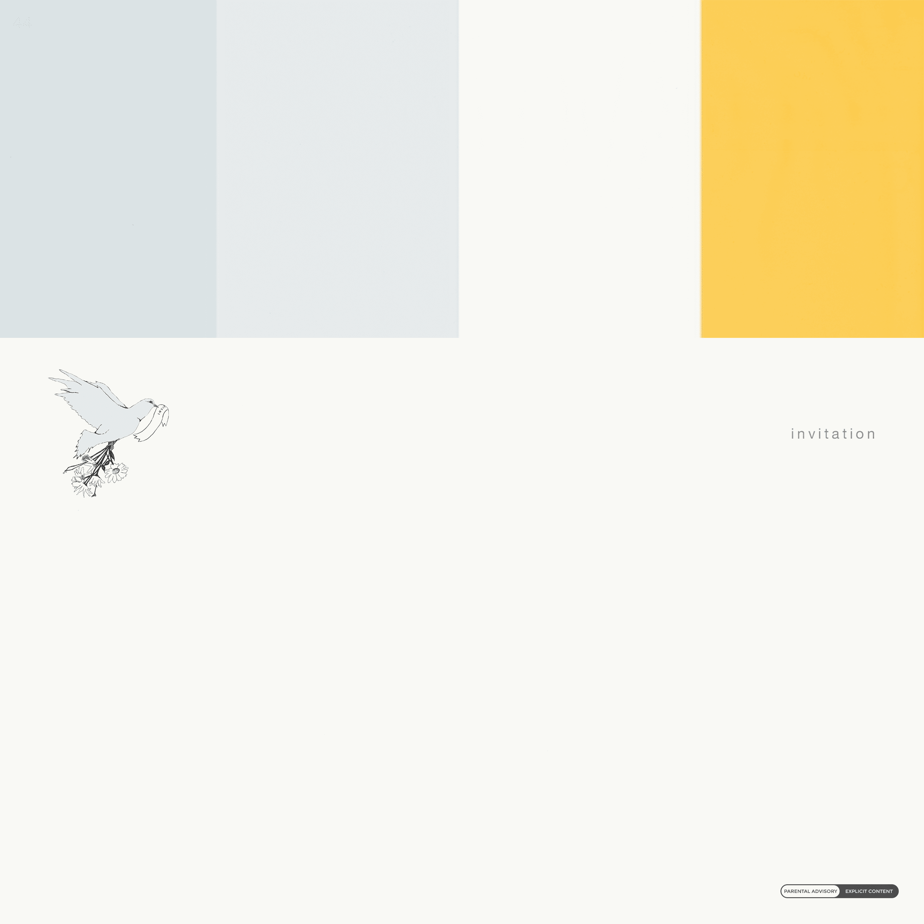
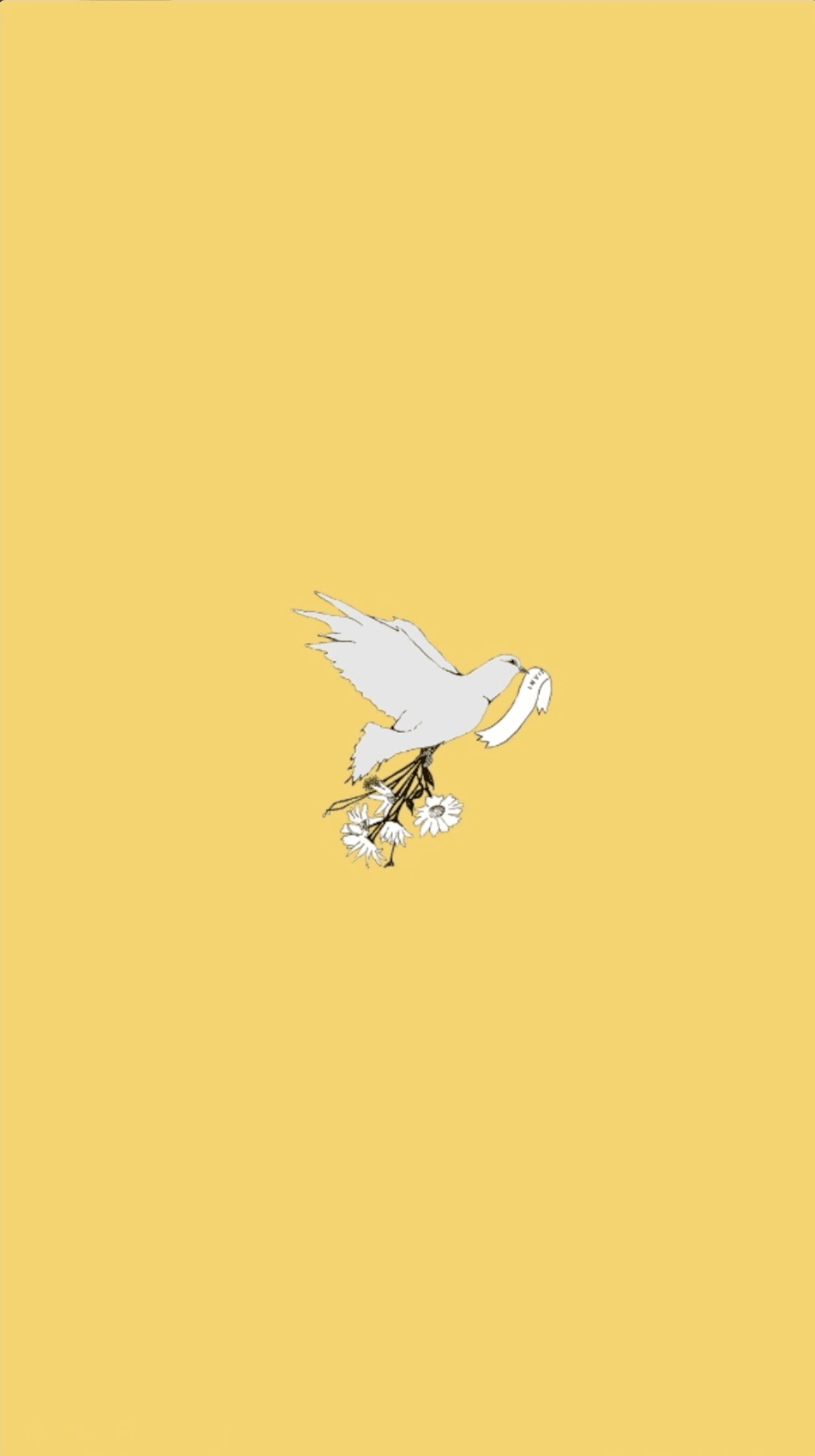
The cover combined a clean layout with muted pastel tones and a single illustrated dove, creating a soft, welcoming space. Minimal typography positioned “invitation” as both theme and action.

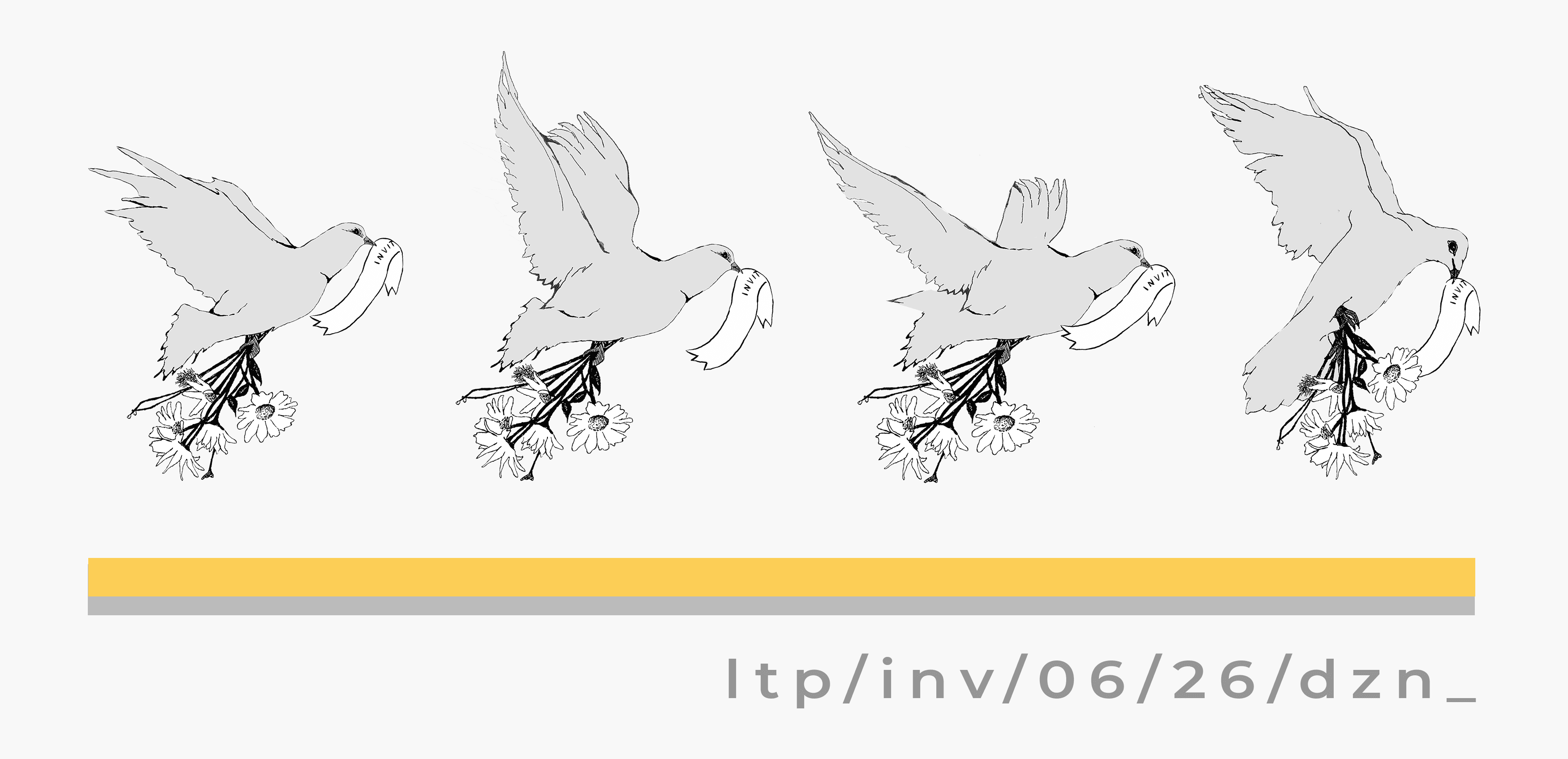

02
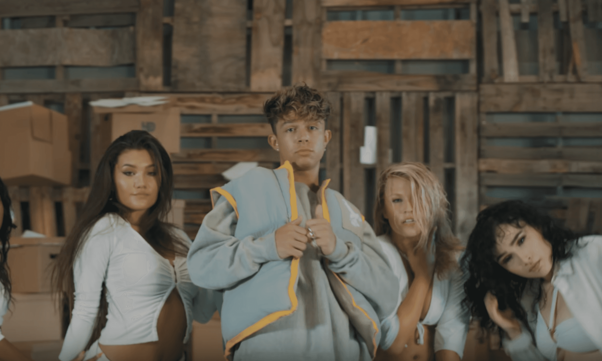
Story loops and launch-day animations used repeated motifs: flying doves, underlines, and left-to-right motion that mirrored the layout philosophy across all media.


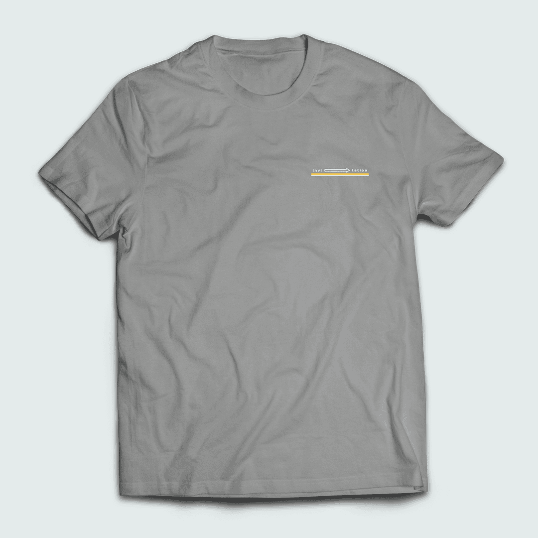
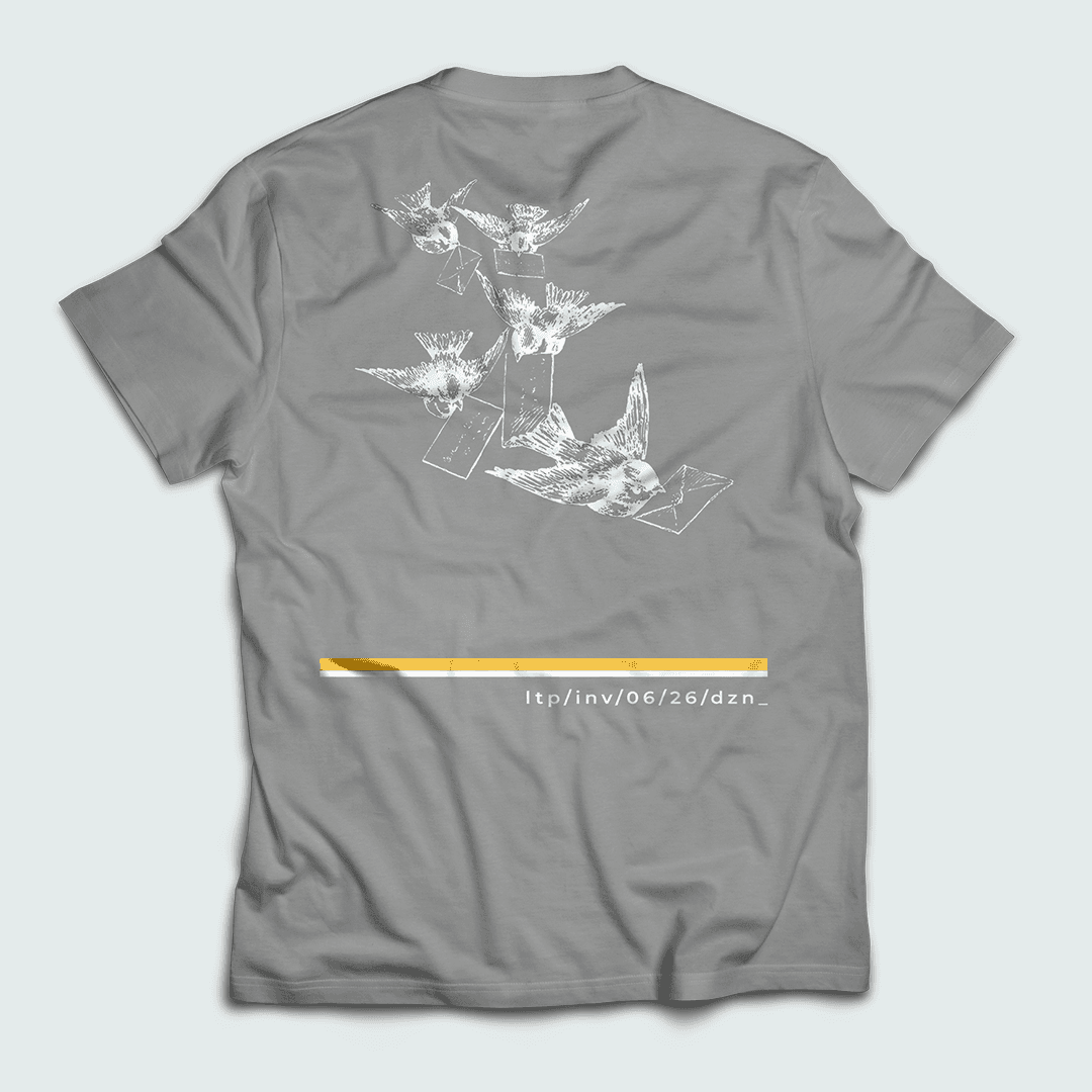
03
Both the white hoodie and grey tee extended the illustration style—featuring sequences of doves in flight and call-to-action URLs styled like postal codes. This treated apparel as a medium of motion and story.

04
Designed to match the tone of the release, the Canvas loop carried over the color palette and graphic restraint, giving a consistent experience even in audio-focused platforms.


05
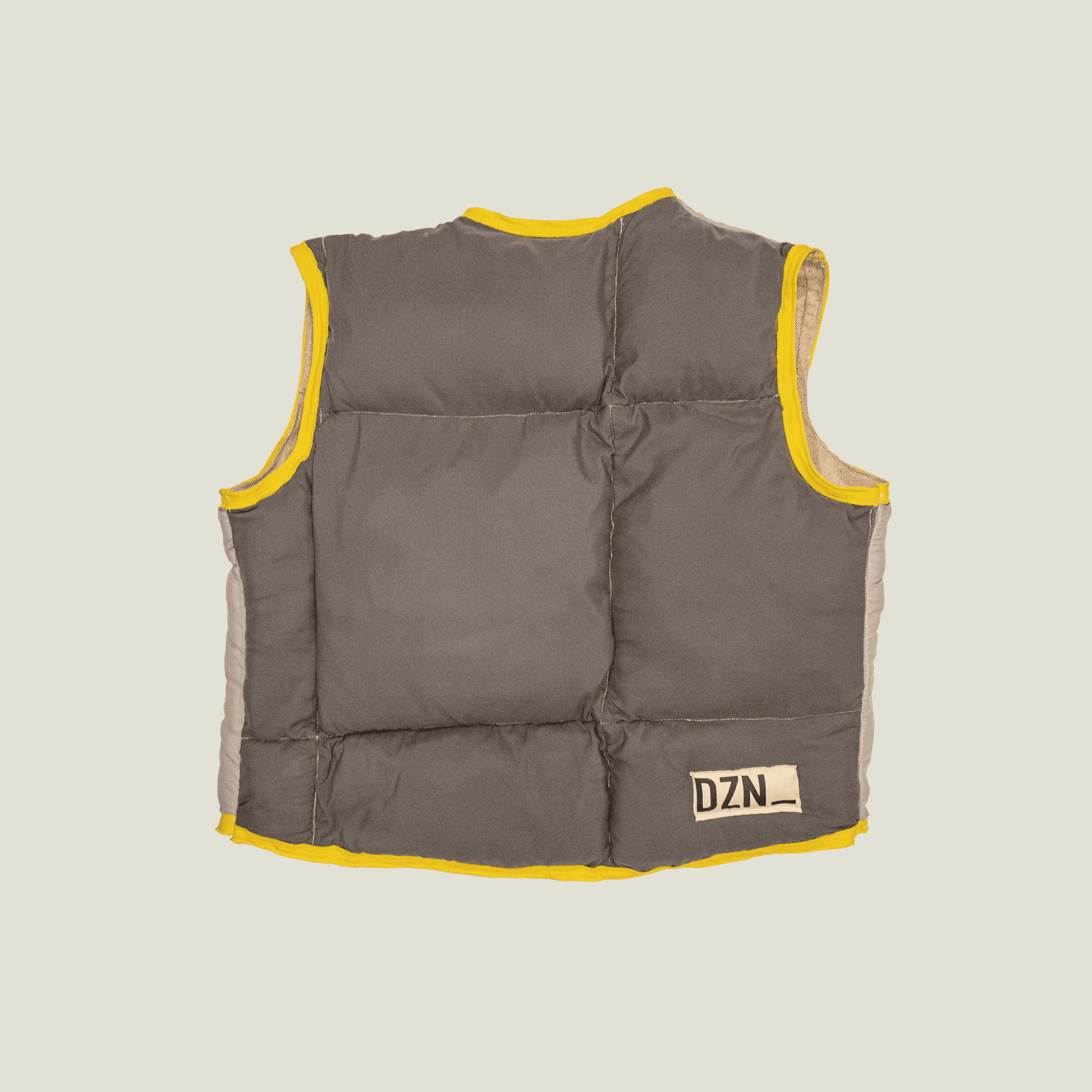
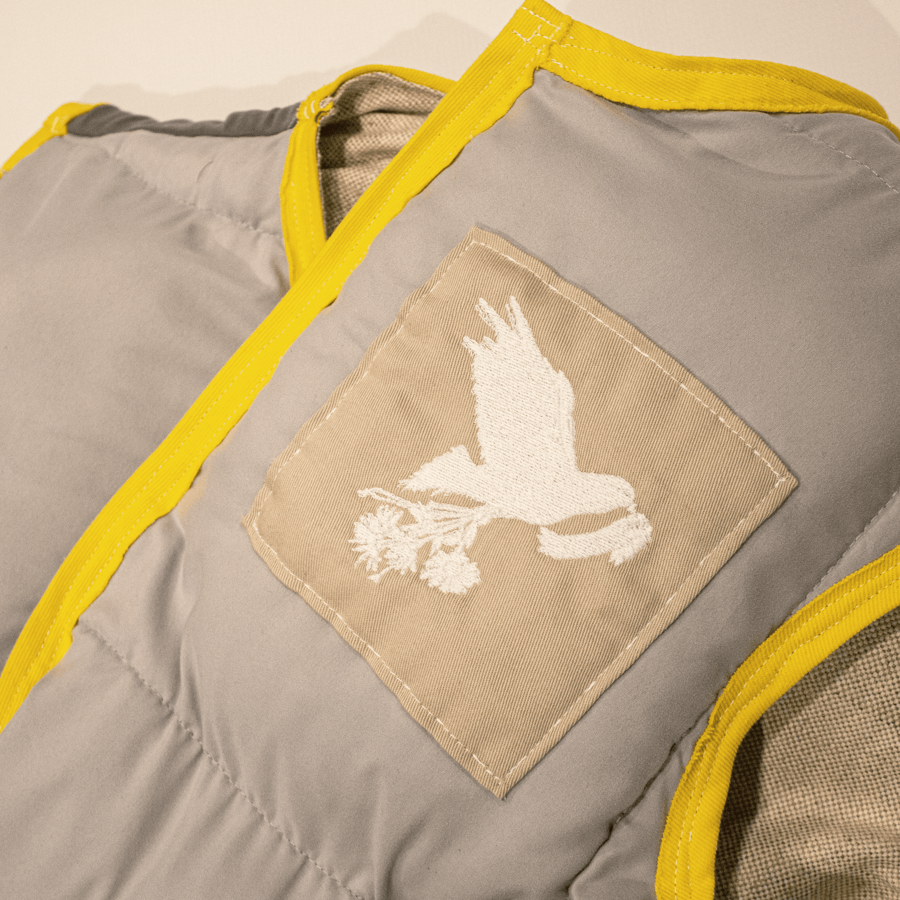
A custom, quilted vest handmade by Heffdzns was crafted specifically for the "Invitation" video campaign.
Dove embroidery nods to the central theme
Yellow contrast stitching mirrors the accent color from the artwork
“Handmade by Heffdzns for Rapta – Invitation” label reinforces the intimacy of the message
This piece functioned as wearable storytelling, offering fans a sense of crafted sincerity and connection.
Every element—from the album cover to the product labels—served as part of a larger message delivery system. This rollout emphasized deliberate calm and thoughtful motion, using visual consistency to subtly cue emotional continuity. The dove, the lines, the direction—everything pointed toward the listener.
Closing Notes
Next
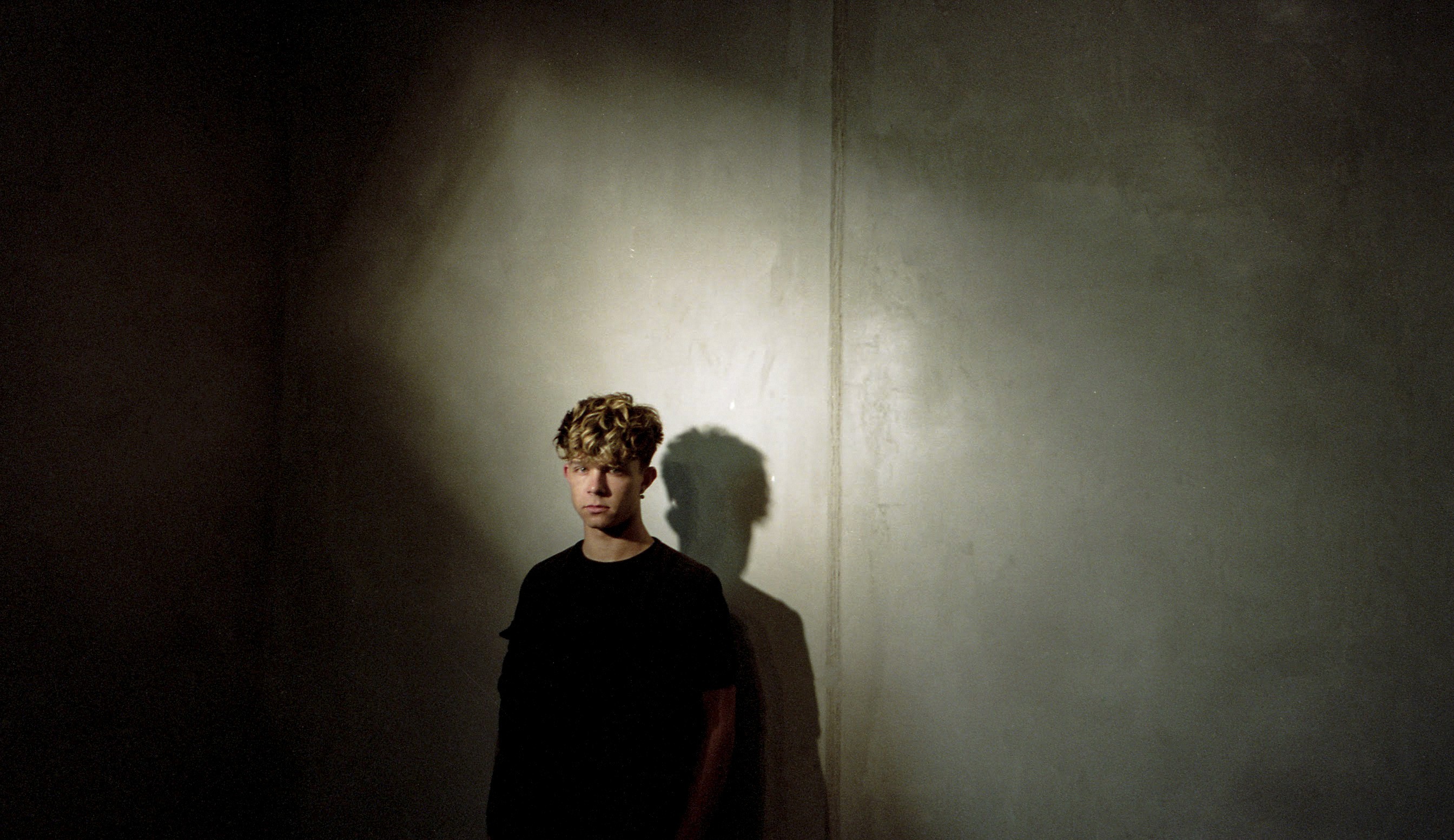
luv, leo was a deeply personal project for Rapta—an album rooted in love, reflection, and identity. My job was to craft a visual world that felt just as intimate as the music, using analog textures, soft palettes, and handcrafted pieces to mirror the emotional tone of the record.