EQ Event Dashboard
EQ Event Dashboard
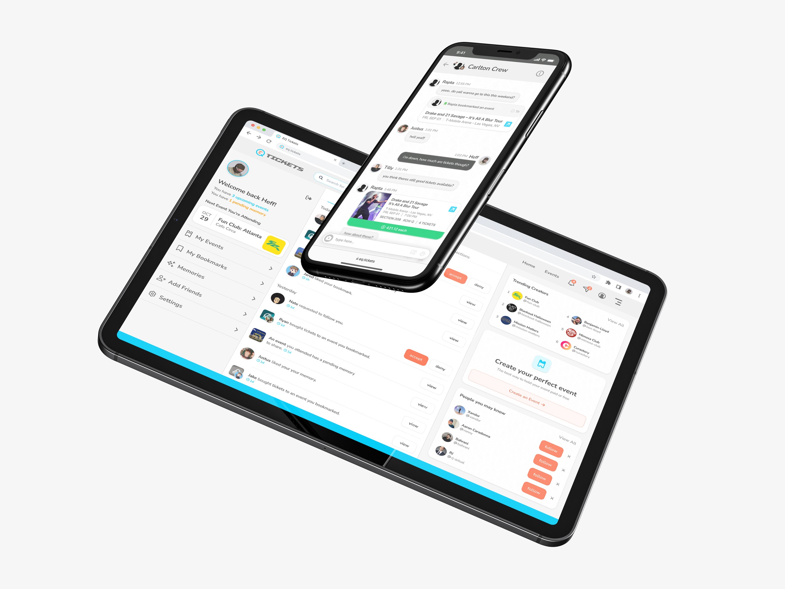
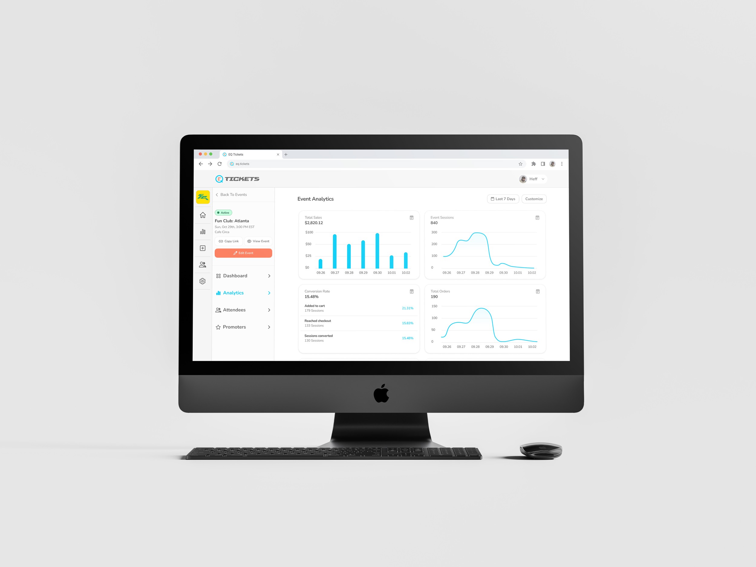
An event analytics and management dashboard designed for event organizers to monitor ticket sales, attendee behavior, and campaign performance in real time. The product replaces fragmented reporting workflows with a single source of truth, giving organizers a fast, visual way to track event health, adjust promotion strategy, and manage attendees from one connected interface.
Year
2024
Client
EQ Tickets
Service
UX/UI Design
Role
Lead UX/UI Designer
01
Project Goals
Simplify Event Performance Tracking
Objective: Give event organizers a clear, real-time view of how each event is performing without needing to pull reports from multiple tools.
Success Metric: Reduce time spent reviewing event performance by 60%.
Sub-Goals:
Consolidate sales, sessions, and conversion data into one dashboard
Prioritize the metrics organizers actually act on
Reduce visual noise from low-value data points
Support fast comparisons across time ranges
Support Multi-Event Management
Objective: Allow organizers to manage multiple active events without losing context between them.
Success Metric: Enable organizers to switch between events in under 3 seconds.
Sub-Goals:
Persistent event selector across all views
Event status indicators (Active, Draft, Ended)
Quick actions for editing, copying links, and viewing public pages
Scoped analytics per event
Improve Decision-Making Around Promotion
Objective: Help organizers understand where attendees drop off and where promotion is working.
Success Metric: Increase repeat use of analytics tools by 45%.
Sub-Goals:
Clear funnel visibility (Added to Cart, Reached Checkout, Converted)
Session data tied directly to conversion outcomes
Promoter attribution built into the data model
Trend visualizations that highlight movement, not just totals
Reduce Operational Overhead for Organizers
Objective: Cut the manual work required to manage attendees, promoters, and event details.
Success Metric: Reduce support requests related to event setup by 35%.
Sub-Goals:
Centralized attendee management
Promoter permissions and access controls
Editable event settings without leaving the dashboard
Actionable states surfaced at the top of the flow
02
Research and Discovery
Research focused on how event organizers actually monitor performance day-to-day, where their existing tools break down, and what decisions they were trying to make with the data in front of them. Stakeholders initially pushed for a heavier feature set with deeper reporting layers, but early user conversations pointed to the opposite need.
Competitive Analysis:
Reviewed ticketing platforms, event management tools, and general analytics dashboards. Ticketing platforms tended to bury insights behind exports. General analytics tools offered flexibility but no event-specific context. The gap was a focused, event-native view.
User Types:
Event Organizers running one or more active events
Promoters driving traffic to specific events
Attendees interacting with event pages (indirect user)
Key Insights:
Organizers checked performance multiple times a day but rarely acted on more than 4 or 5 metrics
Most users abandoned reports when they required more than one click to reach
Promotion data and sales data lived in separate tools, forcing manual reconciliation
Simpler dashboards were consistently preferred over feature-dense ones during testing
Journey Mapping:
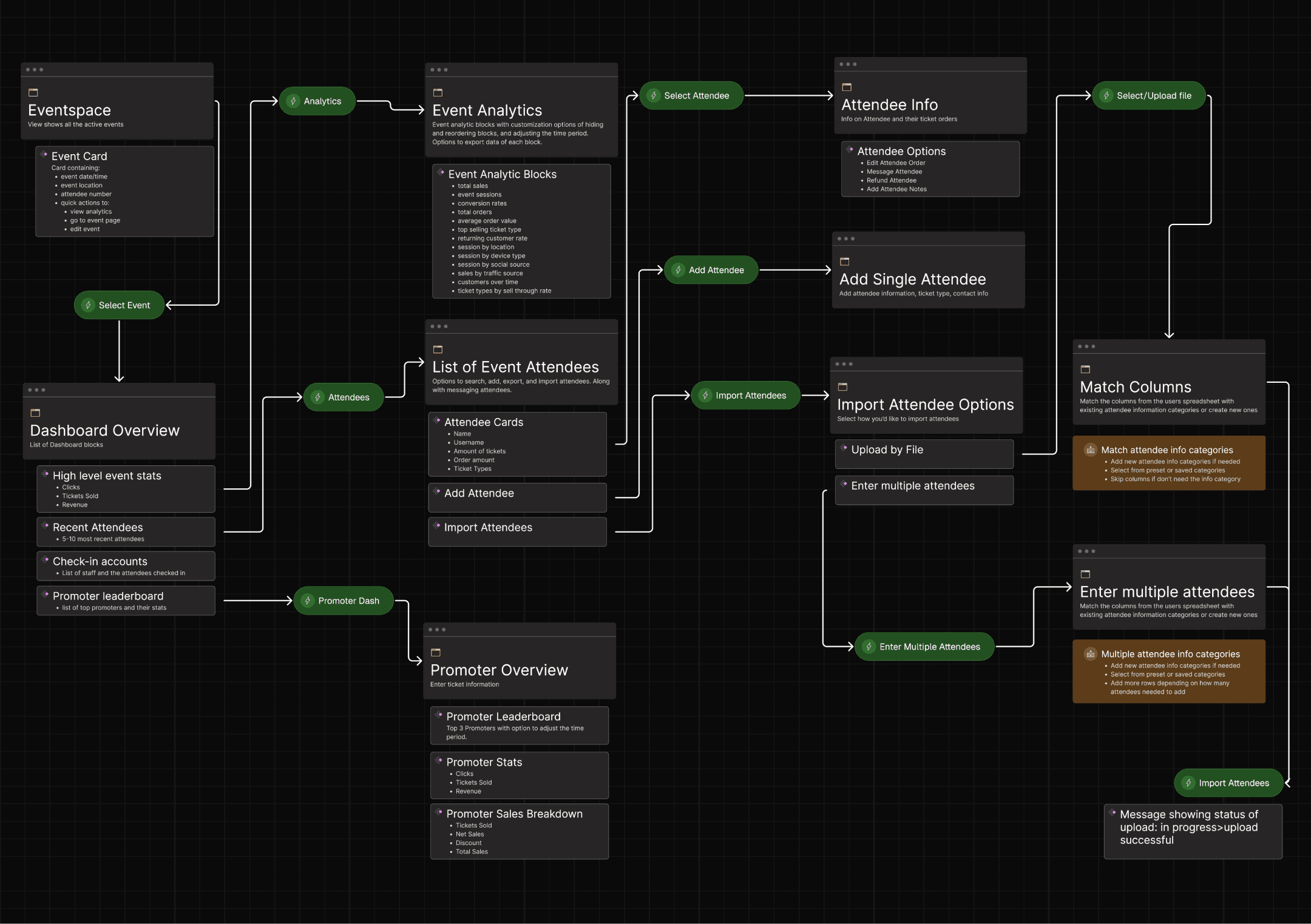
Mapped the flow from event creation to post-event review. Friction concentrated around switching between events, interpreting conversion drop-off, and managing promoters without a clear permissions model.
03
Key Findings
Fragmented Data Sources:
Hosts often struggled with data spread across multiple platforms, making it difficult to get a comprehensive view of their event’s performance.
Need for Real-Time Data:
Many hosts expressed the need for real-time data to monitor their event’s progress and make quick decisions.
Complexity in Data Analysis:
Users found it challenging to analyze data, especially when dealing with large datasets or multiple metrics.
Desire for Customization:
Hosts wanted the ability to customize their dashboard to focus on the metrics most relevant to their specific events.
04
Wireframing and Prototyping
Lo-Fi Sketches:
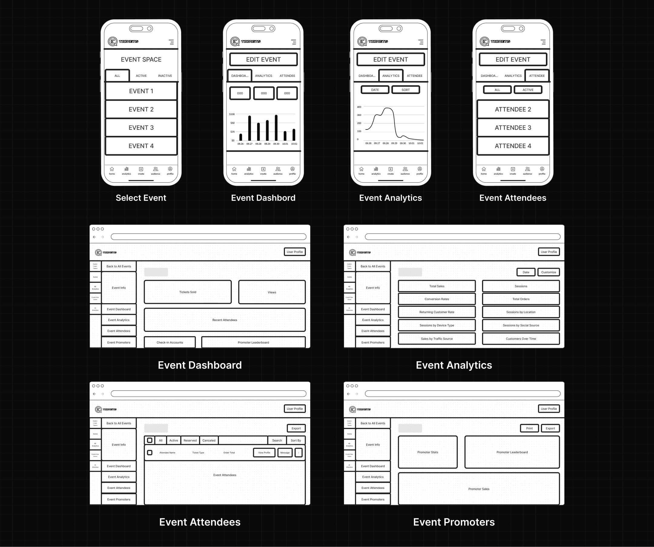
Early sketches explored how much data could live on a single screen without overwhelming the user. Multiple layouts were tested to find the right balance between summary metrics and trend visualizations.
Mid-Fi Prototypes:
Focused on the event context pattern, the analytics grid, and the navigation model. Tested with organizers to validate that the four-metric layout matched how they actually reviewed events.
Hi-Fi Prototypes:
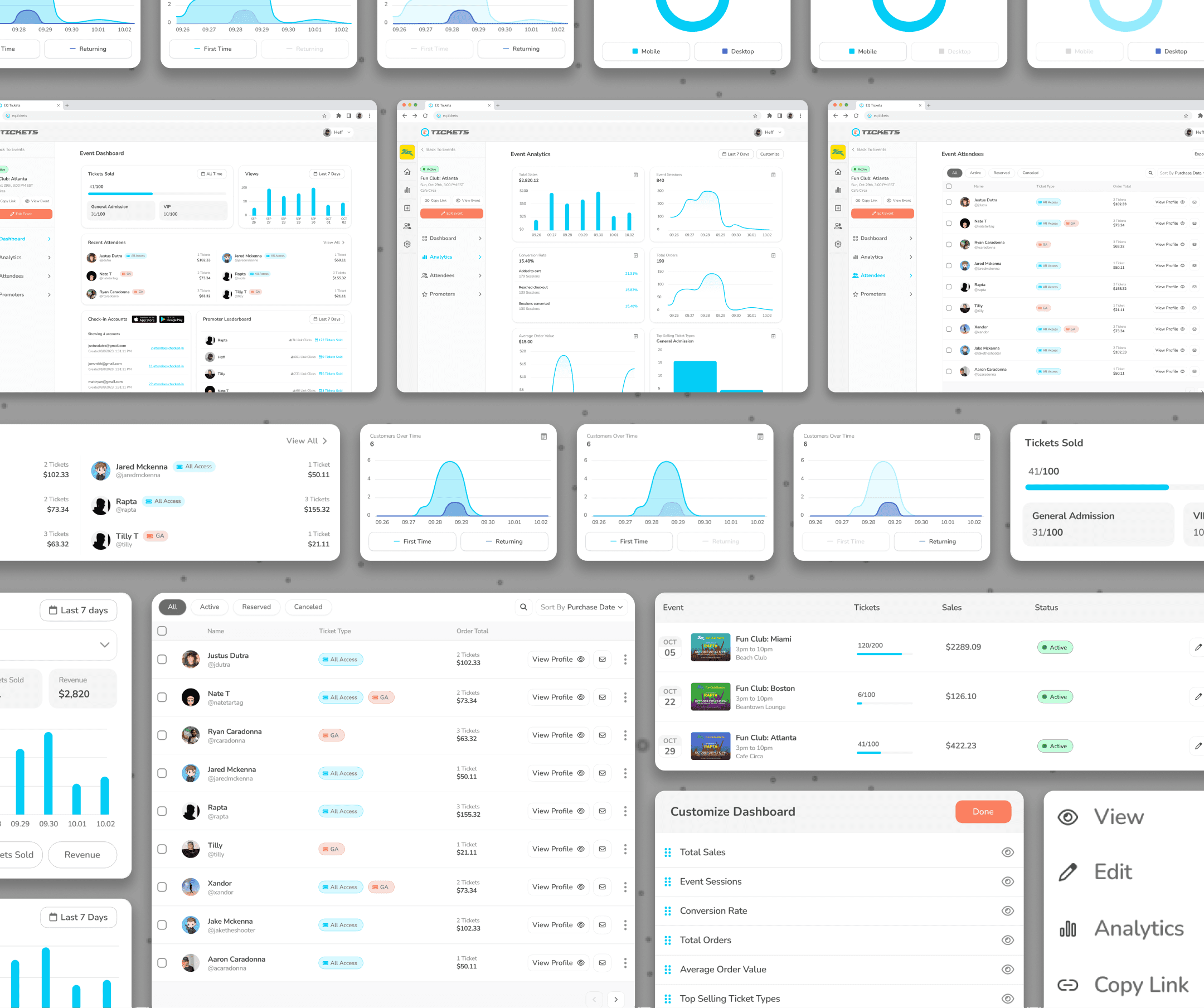
Refined chart styling, spacing, and interaction states. Introduced the customizable time range, the compact event card, and the quick-action buttons for copying links and editing events.
Design System:
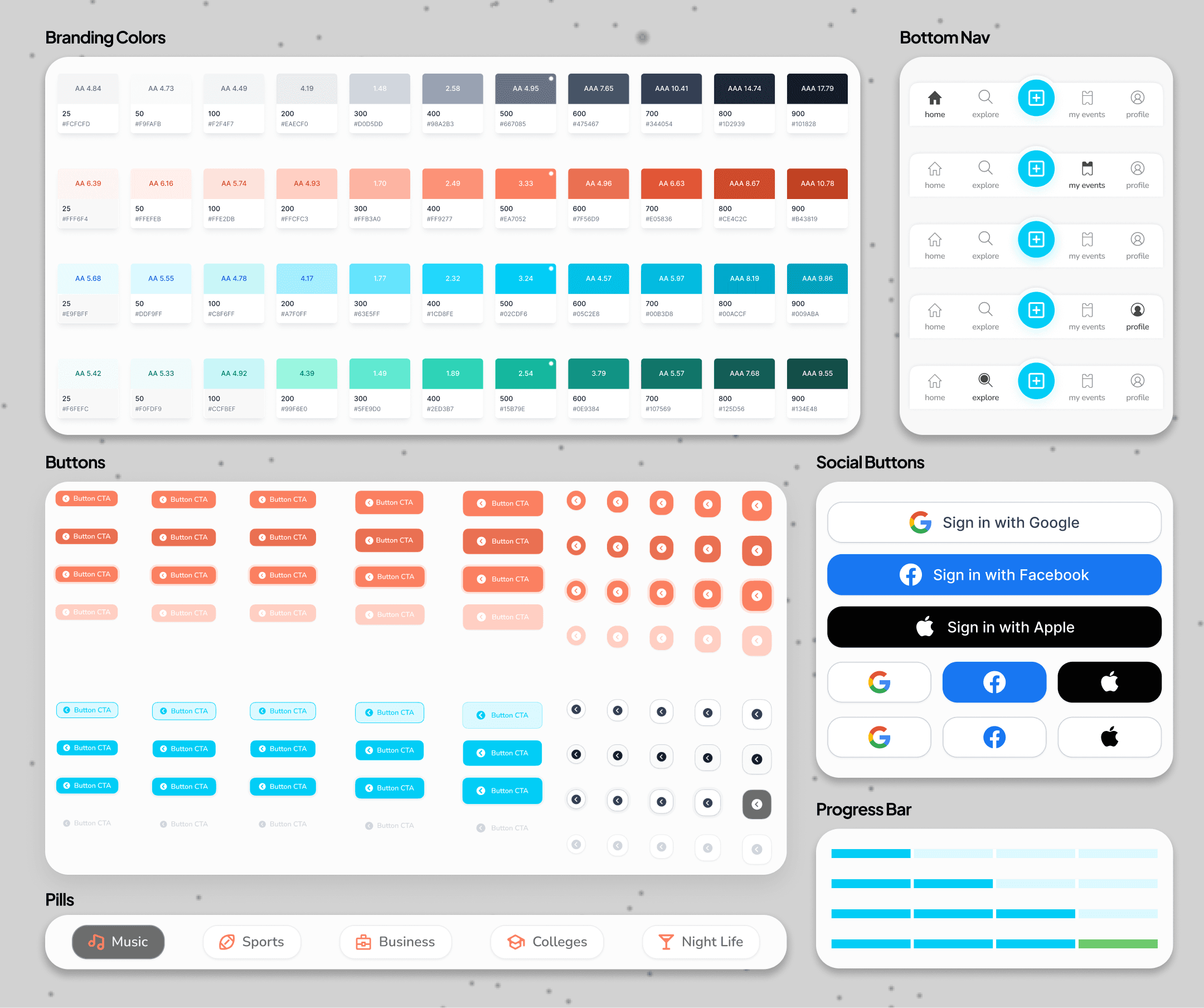
Built a reusable set of chart components, KPI cards, status badges, event cards, and navigation patterns. All components were designed to scale across future views like Attendees and Promoters without redesign.
05
Key Features
Real-Time Data Filtering:
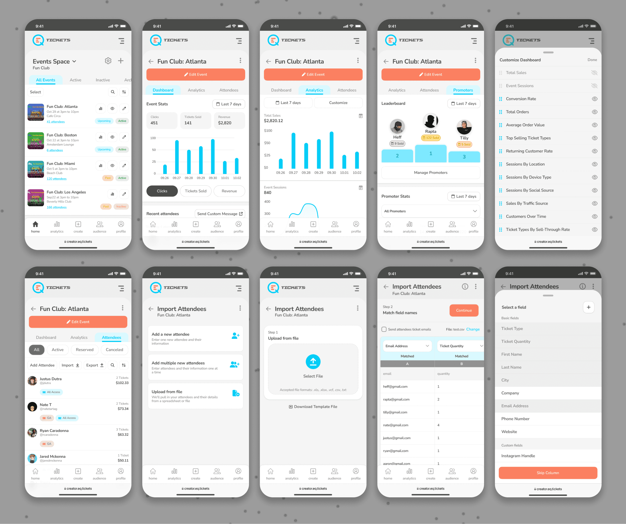
Users can toggle between different views within analytics widgets, such as Sessions by Location, Ticket Types, and Returning Customer Rate, to isolate key insights.
Segmented Audience Analysis:
In the Returning Customer Rate chart, users can hover or tap to switch between All Customers, First-Time Attendees, or Returning Customers, helping hosts track audience retention trends.
Device & Engagement Tracking:
The Sessions by Device Type graph allows users to toggle between All Sessions, Mobile Sessions, and Desktop Sessions to understand where ticket buyers are engaging the most.
Adaptive Data Visualization:
Graphs adjust in real-time, ensuring that trends and engagement metrics are always up to date and easy to interpret.
Tap & Hover Adjustments:
Users can tap on individual data points to drill deeper into specific timeframes, while on desktop, hovering provides detailed insights.
Date Range Customization:
The dashboard includes quick filter options like “Last 7 Days” or a custom date range selector to analyze performance over different periods.
Adaptive Graphs & Trends:
The interactive charts adjust based on user selections, ensuring a clear and digestible representation of financial performance, attendee engagement, and sales data.
Real-Time Updates:
As ticket sales and attendance grow, the dashboard dynamically refreshes, giving event hosts real-time visibility into their event’s performance.
Seamless CSV Upload:
Hosts can quickly import attendee lists by uploading a CSV file, reducing manual entry and ensuring accurate data transfer.
Bulk Attendee Management:
The import tool allows hosts to add multiple attendees at once, saving time when handling large-scale events.
Real-Time Data Validation:
The system automatically detects duplicate entries, missing fields, or errors in uploaded files, ensuring data consistency before finalizing the import.
Auto-Assign Ticket Types:
When importing, hosts can predefine ticket types (e.g., GA, VIP, All Access), making ticket distribution seamless.
Integrated with Analytics & CRM:
Imported attendees instantly sync with event analytics and reporting, giving hosts real-time insights into audience composition and engagement.
Next
I was tasked with designing an intuitive and social-driven user profile experience that seamlessly integrates event discovery, social interactions, and ticket management.