Tix4Cause — Buy Tickets. Make an Impact.
Tix4Cause — Buy Tickets. Make an Impact.
Tix4Cause is a charity-based ticket marketplace that enables users to purchase or donate event tickets while automatically supporting nonprofit causes at no extra cost. The platform connects live entertainment such as concerts, sports, and theatre with social good, allowing ticket buyers, donors, and nonprofits to coexist within one ecosystem.
Year
2025
Client
Tix4Cause
Service
UX/UI Design
Role
Lead UX/UI Designer

01
Project Goals
Create a Purpose-Driven Ticket Buying Experience
Objective: Embed charitable impact directly into the ticket discovery and purchase flow without adding friction or cognitive load.
Success Metric: Increase ticket purchase completion rate while maintaining or improving average time to checkout.
Sub-Goals:
Surface cause impact messaging directly within event cards and event detail pages.
Introduce a featured cause per event with the ability to select an alternate cause.
Reinforce impact post-purchase through confirmation states and dashboard summaries.
Display real-time impact indicators such as total donated and causes supported in high-visibility areas.
Streamline Hybrid User and Cause Admin Experience
Objective: Support both everyday ticket buyers and cause administrators within a single unified account system.
Success Metric: Eliminate the need for multiple logins or dashboard switching for users with multiple roles.
Sub-Goals:
Design a single dashboard that conditionally reveals buyer and cause admin functionality.
Group navigation items clearly by category such as personal activity and cause management.
Ensure users can register a cause directly from their existing dashboard.
Maintain consistent navigation and mental models across all roles.
Reduce Cause Onboarding Friction and Drop-Off
Objective: Make it easier for nonprofits to register, complete, and submit their cause for approval.
Success Metric: Increase cause onboarding completion rate and reduce abandonment during multi-step registration.
Sub-Goals:
Create a draft cause record immediately after user registration.
Allow onboarding to be saved and resumed from the dashboard at any time.
Reuse cause management UI for both onboarding and post-approval editing.
Clearly indicate progress and remaining required steps before submission for review.
Make Donated Tickets Understandable and Trustworthy
Objective: Clearly communicate how donated tickets work and why they matter to donors, causes, and purchasers.
Success Metric: Increase engagement and sign-ups for donated ticket functionality prior to launch.
Sub-Goals:
Explain donated ticket use cases for individuals, season ticket holders, corporations, and artists.
Highlight privacy code functionality to give donors peace of mind.
Clearly communicate tax acknowledgment benefits for donors.
Position donated tickets as unique, high-value opportunities for purchasers.
Capture emails from interested users to build anticipation and education ahead of launch.
Build a Scalable Design System for Growth
Objective: Establish a reusable, flexible design system that supports rapid iteration across consumer and admin experiences.
Success Metric: Enable engineering to reuse the majority of components across new features and flows.
Sub-Goals:
Define consistent typography scales for marketing, marketplace, and dashboard use.
Create reusable components for cards, tables, filters, counters, and banners.
Support both desktop and mobile responsive layouts using the same component set.
Maintain visual consistency across consumer pages, dashboards, and admin tools.

02
Research and Discovery
The design process began with in-depth research to understand how people buy tickets, donate tickets, and manage causes within a single marketplace. The goal was to uncover friction points, role conflicts, and opportunities to better connect entertainment with charitable impact.
Competitive Analysis
I evaluated platforms across three adjacent spaces to understand gaps and opportunities.
Ticketing Marketplaces:
Ticketmaster, SeatGeek, and StubHub dominate event discovery and checkout but lack any built-in charitable impact.
Donation messaging, when present, is often optional, buried, or disconnected from the purchase flow.
Dashboards focus on transactions, not long-term engagement or impact.
Charity and Donation Platforms:
Nonprofit platforms are strong at storytelling and donor communication but are not transactional or event-driven.
Most lack real-time inventory, ticket resale, or experiential incentives.
Donation flows feel separate from everyday consumer behavior.
Hybrid Marketplaces:
Platforms that support multiple user roles often rely on separate dashboards or logins.
Switching contexts introduces confusion and increases drop-off for users with more than one role.
Few examples successfully merge consumer and admin experiences in a single interface.
Key User Types
Everyday ticket buyers who want simple discovery, checkout, and transparency around impact.
Ticket donors including individuals, season ticket holders, corporations, teams, artists, and athletes.
Cause administrators responsible for managing listings, donations, and approvals.
Nonprofit team members who support operations, reporting, and outreach.
A major challenge was designing for overlap, as many users fall into more than one category over time.
User Interviews and Stakeholder Input
Insights were gathered through internal stakeholder conversations, design reviews, and feedback from existing Tix4Cause users.
Key findings included:
Users want to support causes but do not want extra steps or complexity during checkout.
Cause admins need flexibility to update information over time rather than complete everything in one session.
Donors value trust signals such as privacy controls, transparency, and tax documentation.
Purchasers are drawn to unique or exclusive ticket opportunities when impact is clearly communicated.
Journey Mapping
I mapped the end-to-end experience across both consumer and admin flows.
Key journeys included:
Discovering an event and understanding its charitable impact.
Purchasing tickets and selecting or being assigned a cause.
Donating unused tickets and controlling who can access them.
Registering and managing a cause from initial signup through approval and ongoing updates.
This process surfaced several drop-off points, particularly during cause onboarding and role switching, which directly informed the decision to unify dashboards and reuse management interfaces across onboarding and long-term use.
03
Key Findings
Emotional clarity drives trust:
Users want to feel good about helping, but not confused or pressured.
Impact must be visible, not buried:
Donation totals, causes supported, and outcomes should be surfaced naturally throughout the experience.
One user, many roles:
Users may be buyers, donors, or cause admins. Forcing separate dashboards or logins creates friction.
Long onboarding needs flexibility:
Cause admins often do not have everything ready in one session. Resume-later functionality is essential.

04
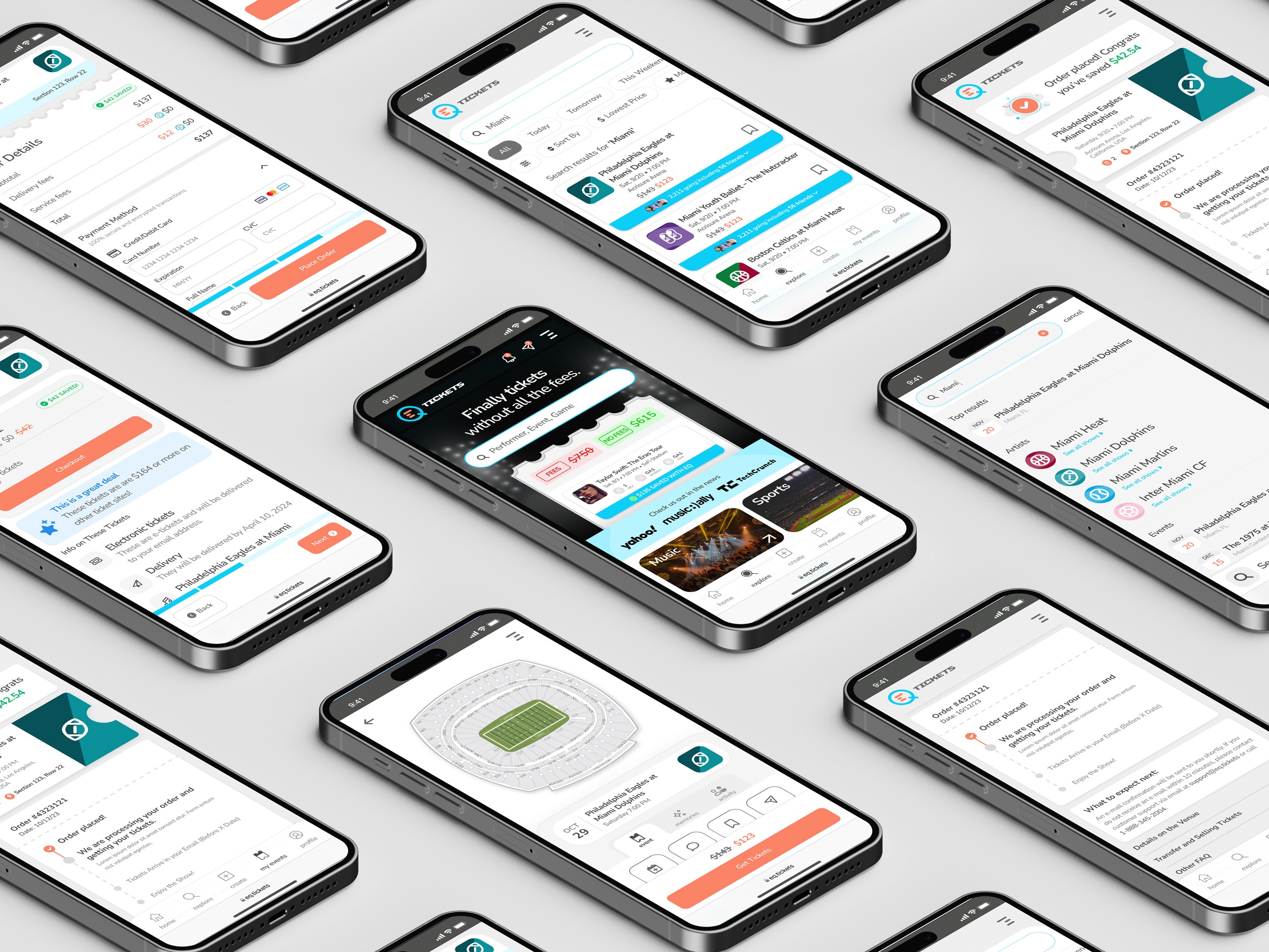
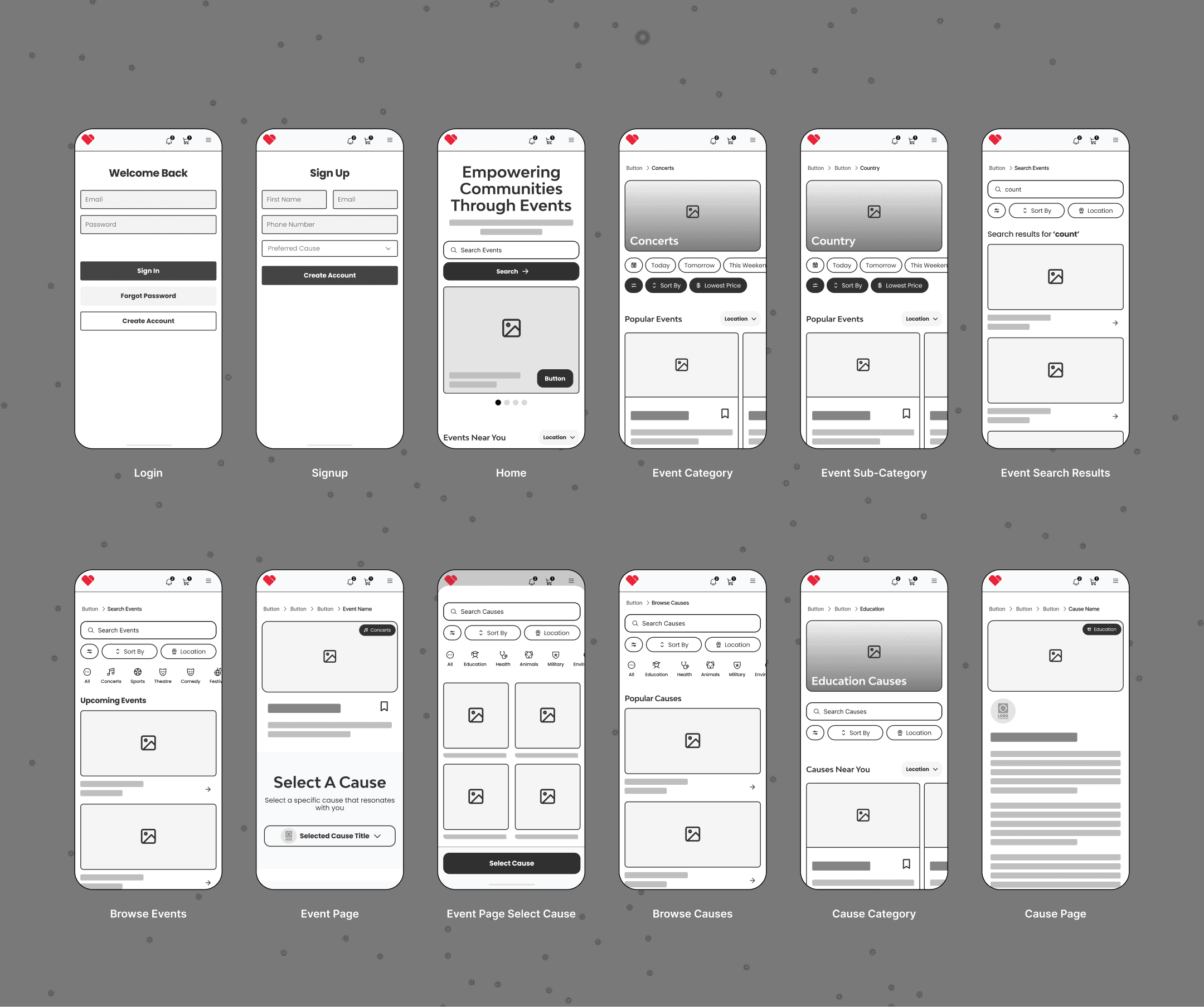
Wireframing and Prototyping
Lo-Fi Sketches (Paper and Figma)
Mapped primary user journeys including event discovery, ticket purchase, ticket donation, and cause administration.
Sketched unified dashboard concepts to support both consumer and cause admin roles within a single account.
Explored multiple sidebar structures to avoid forcing users to switch dashboards or contexts.
Iterated on content hierarchy for impact messaging so donation value was visible without interrupting checkout behavior.
Mid-Fi Figma Prototypes
Built clickable flows for:
Browse → Event Detail → Ticket Selection → Checkout
Donate Ticket → Select Cause → Confirmation
User Dashboard → Cause Registration → Cause Management
Tested variations of impact counters, cause selectors, and table-based views for purchases and donations.
Internal reviews validated that consolidating onboarding and long-term cause management into one interface reduced perceived complexity and improved clarity.
Refined admin tables to balance scanability with emotional reinforcement through subtle impact cues.
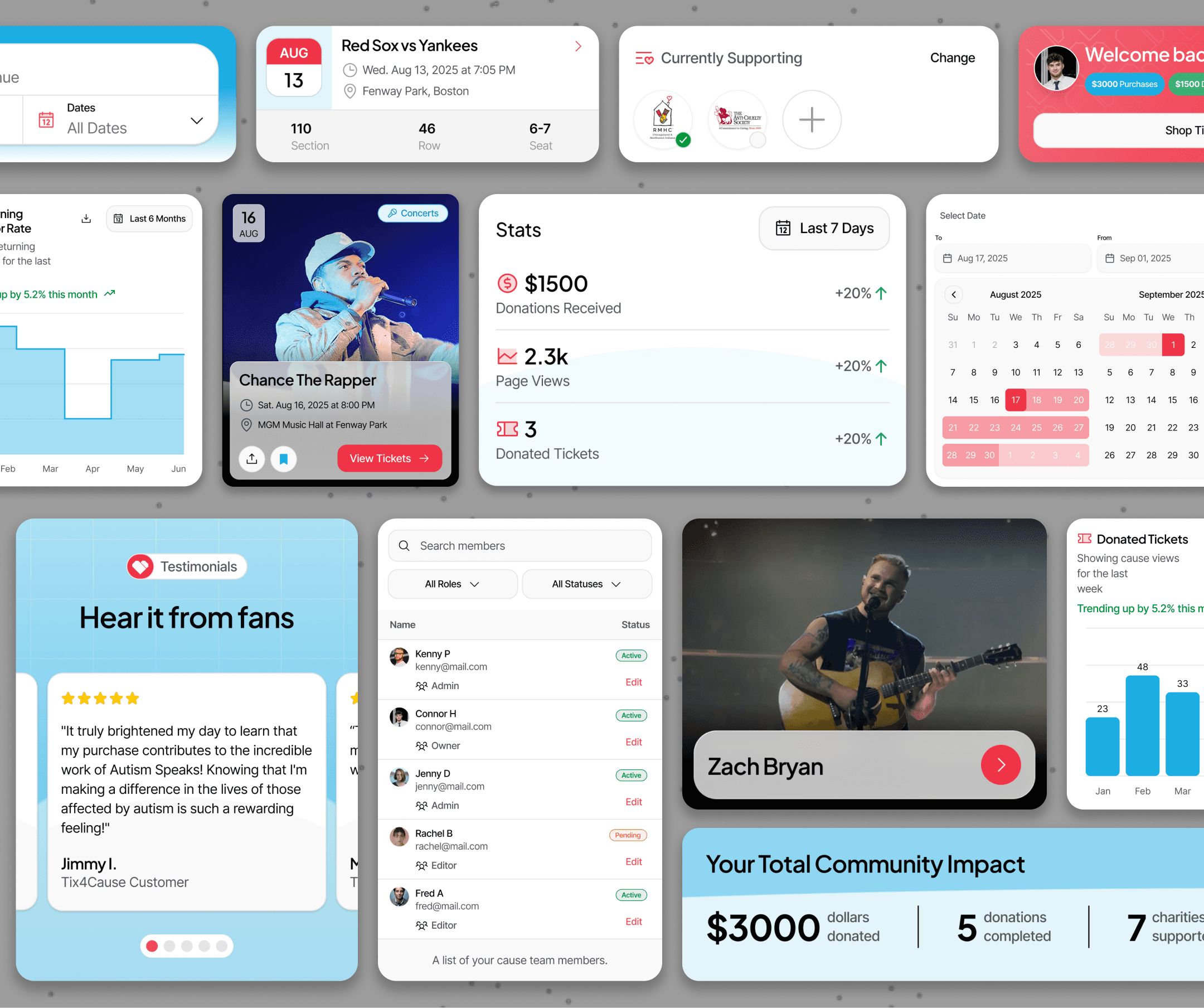
Hi-Fi Interactive Prototypes
Applied the brand’s blue and neutral palette with Accent Orange used sparingly for primary actions.
Introduced soft gradients and abstract shapes to support emotional storytelling without competing with marketplace usability.
Simulated real data across dashboards including donations, purchases, ticket status, and cause performance.
Prototyped interactive elements such as animated counters, expandable tables, and contextual callouts to reinforce impact at key moments.
Design System Development
Established a scalable component library in Figma to support both consumer and admin experiences.
Core components included:
Event cards
Cause cards
Impact counters
Dashboard widgets
Table-based admin views
Defined typography styles for headings, body text, captions, and UI labels.
Created color tokens for primary, secondary, neutral, success, warning, and error states to support future expansion.
Ensured components were reusable across marketing pages, dashboards, onboarding flows, and future feature releases.
05
Key Features
Persistent Search and Filter Bar:
Brief description explaining that the control remains visible and accessible while browsing results.
Full-Screen Filter Overlay:
Description of tapping a control to open an expanded, immersive panel for adjusting options.
Real-Time Feedback:
Explanation that results respond immediately as users interact with controls, without extra confirmation steps.
Clear Visual State:
Notes on how active selections are visually differentiated and easily removable, including a global reset option.
Saved Presets:
Description of allowing users to save and reuse custom configurations for faster future interactions.
Unified Event Discovery Surface:
Brief description explaining that events are immediately discoverable on page load, reducing friction between arrival and browsing.
Prominent Search Entry Point:
Description of a centrally placed search experience that allows users to quickly find events by artist, team, venue, or city.
Featured Causes Highlight:
Explanation of how a featured cause is surfaced alongside events to immediately communicate the platform’s charitable purpose.
Category-Based Browsing:
Notes on clearly defined event categories that allow users to explore concerts, sports, theater, and more without relying on search alone.
Impact-Aware Homepage Cards:
Description of homepage event and cause cards that balance discovery with subtle reinforcement of charitable impact.
At-a-Glance Impact Summary:
Brief description explaining that key metrics are immediately visible when the dashboard loads.
Action-Focused Navigation:
Description of primary management actions being surfaced as clear, touch-friendly entry points.
Mobile-Optimized Data Views:
Explanation of how complex data is adapted into scannable, stacked layouts for mobile use.
Real-Time Status Updates:
Notes on dynamic updates that reflect current states without requiring refresh or manual checks.
Contextual Management Actions:
Description of inline editing or quick-access controls that allow admins to take action efficiently.
Next
I was tasked with designing an event creation app for attendees to create and host their events.