
Sea Sick
Sea Sick is a song that wrestles with emotional overwhelm, internal tides, and feeling adrift. I translated this into a refined, motion-first visual identity that balanced calm minimalism with organic fluidity — evoking the sensation of drifting through both water and feeling.
Year
2023
Client
Rapta
Service
Creative Direction
Tools

01
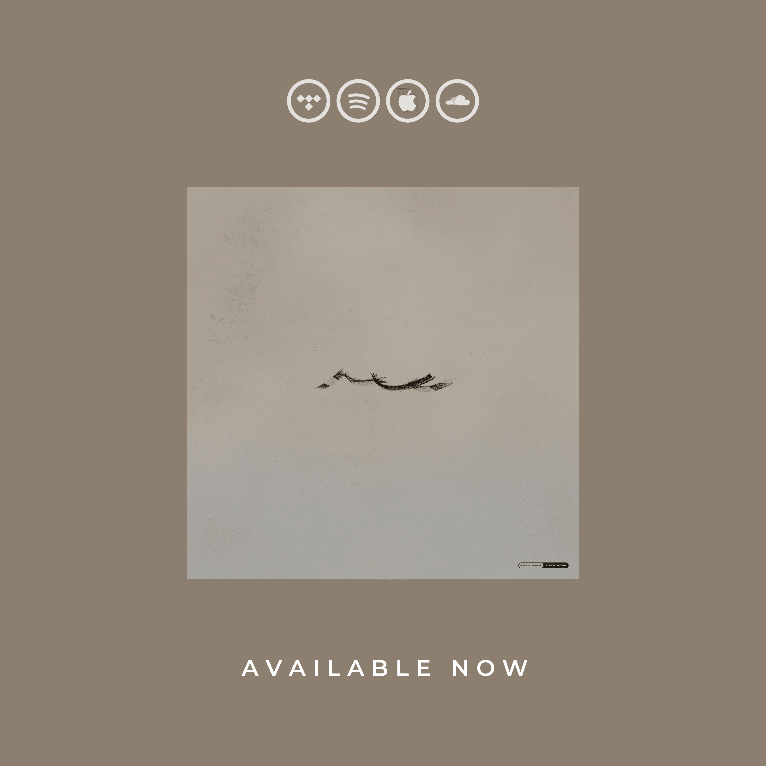
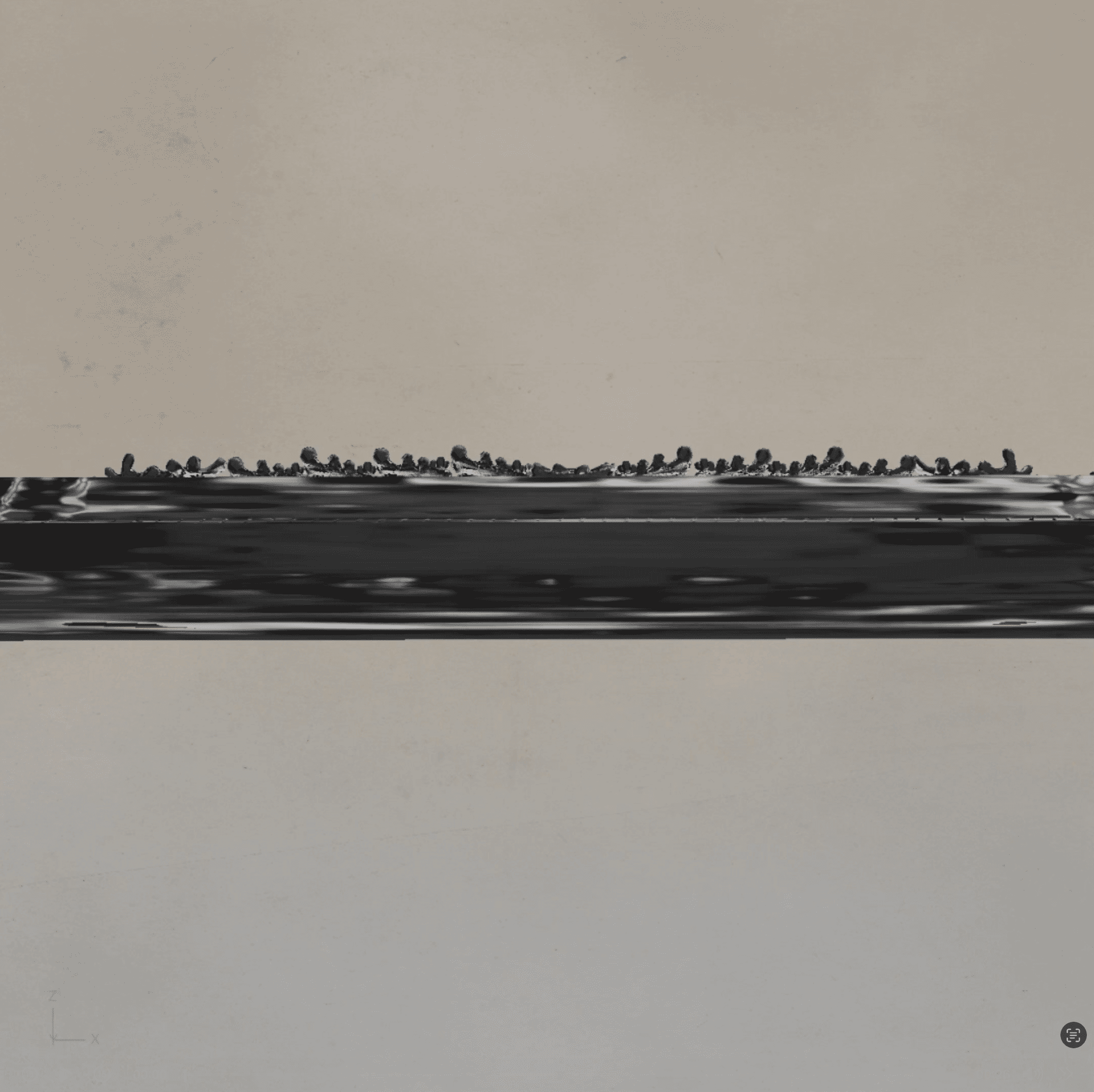
The cover featured a subtle, distressed wave mark on a pale background — quiet, yet emotionally weighty. Its restraint allowed for breathing room and metaphorical interpretation, standing apart in a typically saturated visual field.


02
Created a suite of animated content, all moving with wave-like pacing:
“Available Now” video teasers
Story art and feed loops
Animated versions of the cover and apparel linework
Each piece flowed gently, reinforcing the song’s mood of undulating reflection.

03
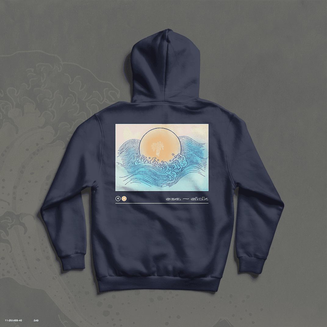
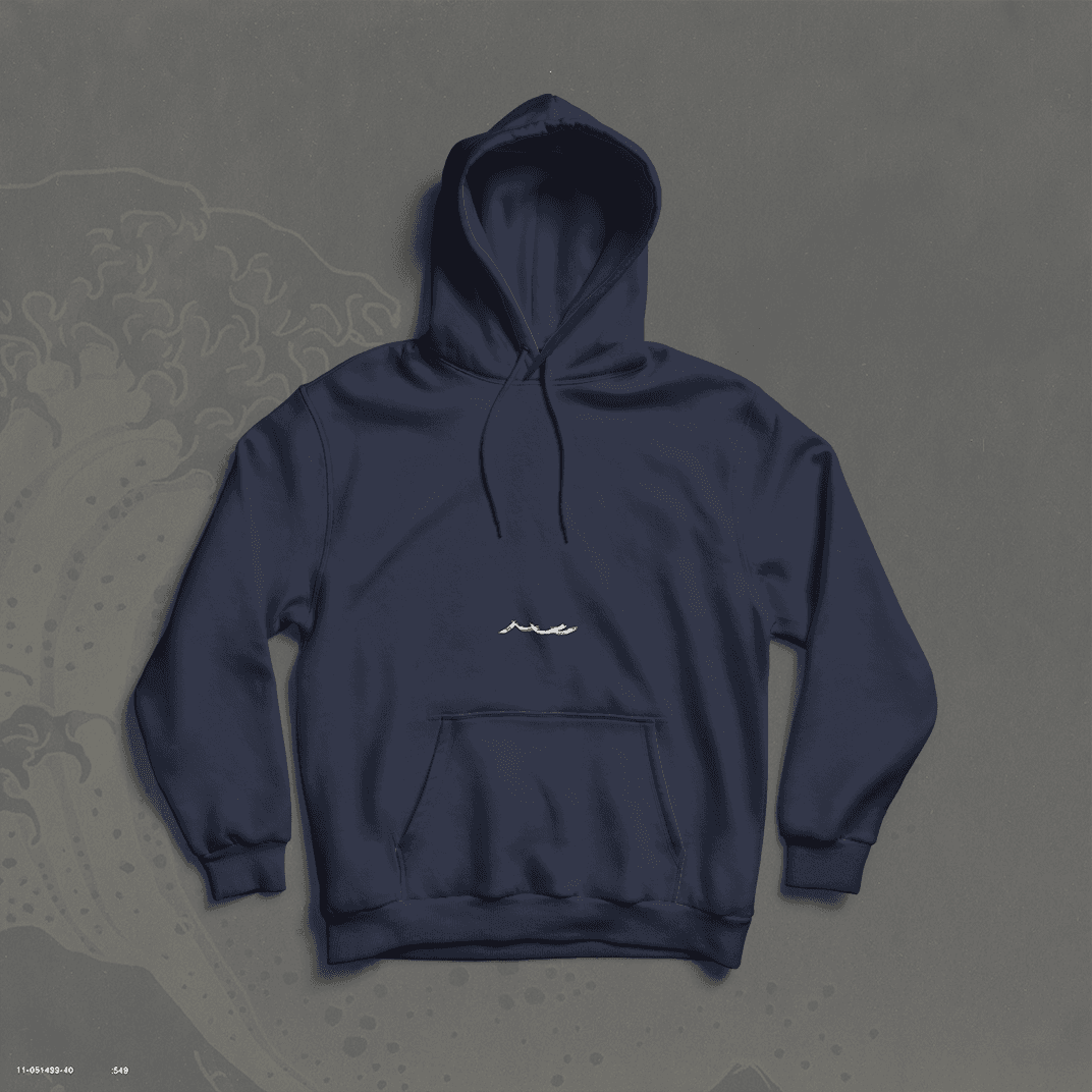
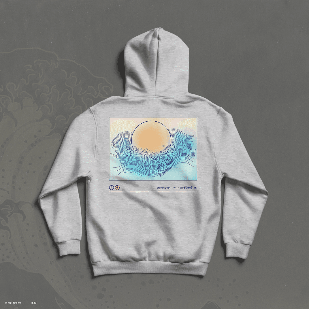
I designed navy and grey hoodies featuring a pastel gradient sun emerging from stylized linework waves. The back of the hoodie felt like an art print — framed and balanced — with subtle “sea sick” labeling, elevating it beyond tour merch into lifestyle wear.

04
A looping vertical video echoed the sea-like motion and pastel palette — gently cycling across textures like tide shifts. It completed the sonic-visual pairing for listeners within the platform.
The Sea Sick rollout proved that clarity can be emotional. Fans connected with the tone across every touchpoint — from swiping through stories to unboxing soft navy hoodies. The result was a controlled, wave-like brand presence that rolled out naturally — and stuck.
Closing Notes
Next
For Rapta’s single Dangerous, I was tasked with developing a unified visual ecosystem that spanned across physical merchandise, digital media, streaming platforms, and web3. The goal was to establish a recognizable, emotionally resonant identity that followed the audience throughout the entire rollout journey.
