
See You
See You explores isolation, pressure, and the fragility of self-image. The creative approach was to turn a traditionally polished rollout into something intentionally deconstructed, assembled, and honest — using everyday materials like tarp, rope, and cardboard to build both the visuals and their metaphor.
Year
2018
Client
Rapta
Service
Creative Direction
Tools
01
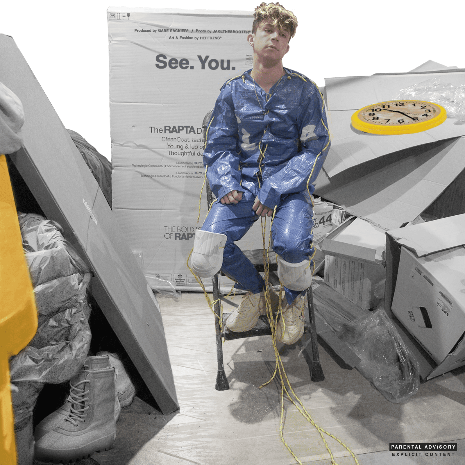
The cover featured Rapta seated in a makeshift set — surrounded by flattened cardboard, a toy clock, and a tarp-based jumpsuit. The backdrop: a printed cardboard wall labeled “See. You.” — doubling as both fashion label and personal reckoning.


02
Promotional videos and loops like the clock spin animation emphasized the stuck-in-time, looping pressure of the song’s theme. Stories and feed pieces retained the collage texture and brutalist energy.


03
The signature look — designed and constructed by hand — was made from:
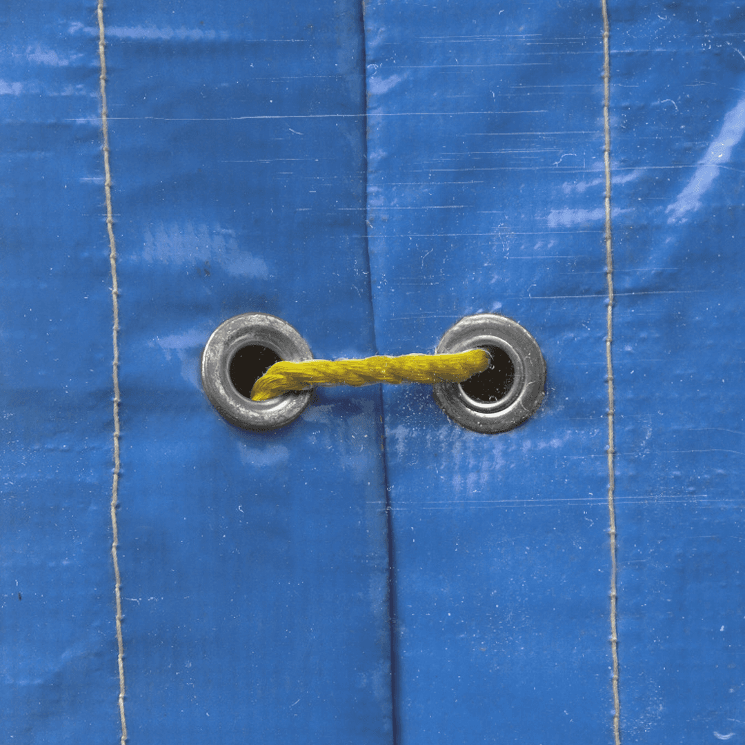
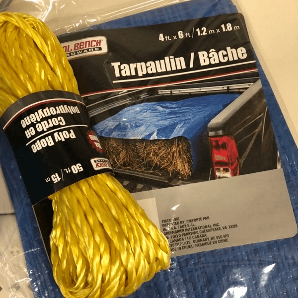
Industrial blue tarp
Yellow rope for lacing & articulation
Knee pads + stitched paneling
It became a symbolic suit of protection — crafted from the discarded, repurposed into armor.

04
A slow, washed-out loop from the video set that reinforced the physical texture and repetition of the visual language — keeping the tension even in platform-native vertical video.
See You challenged the norms of album visuals by constructing its identity from literal scraps — creating something striking, intentional, and human. Every rope, tape line, and clock hand felt connected to the same emotional structure — built from pressure and made to last.
Closing Notes
Next
For Rapta’s single Dangerous, I was tasked with developing a unified visual ecosystem that spanned across physical merchandise, digital media, streaming platforms, and web3. The goal was to establish a recognizable, emotionally resonant identity that followed the audience throughout the entire rollout journey.
